
How might we design a conference experience that invites people in—not just as attendees, but as active participants?

Oct 2018 - Dec 2018 (2 Months) /
Team of Two (Eunjung Kim & Yu Fu)
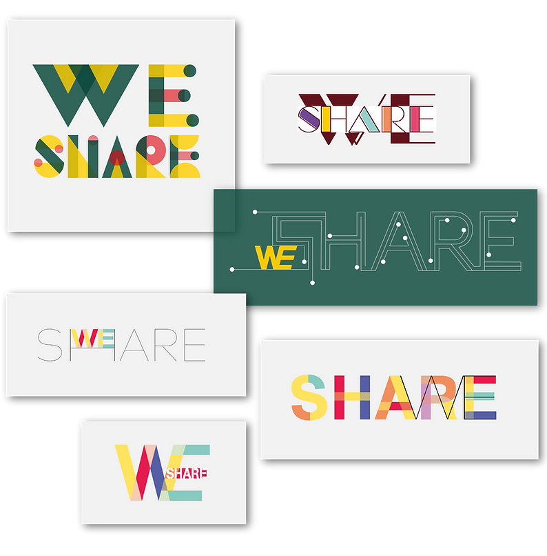
WE2018
We2018 is a conceptual design project that reimagines the conference experience as something more participatory and emotionally engaging. Developed over two months in collaboration with designer Yu Fu, the project centers around a one-day imaginary event focused on the Sharing Economy. Instead of simply promoting attendance, WE2018 aimed to create touchpoints that encourage curiosity, empathy, and deeper involvement—before, during, and after the event. This was an early exploration into designing not just for function, but for feeling, connection, and engagement across the user journey.
Adobe Illustrator
|
Adobe Photoshop
|
Sketch
|
Principle
1. Framing the Design Question
This project began with a shared observation: traditional conferences often feel one-directional. Attendees come, listen, and leave—without much lasting engagement. We wondered if there could be a different way to frame the experience—one that invites people in not just as an audience, but as participants who feel seen, involved, and emotionally connected.
With that in mind, we began designing an imaginary one-day conference, WE2018, centered on the theme of the Sharing Economy. Rather than focusing only on logistics or content, we asked: How might we create moments of empathy, invitation, and interaction throughout the entire user journey? From first hearing about the event to navigating the space to reflecting afterward, we sought to craft a more meaningful arc—one that transforms passive attendees into active participants.
2. Research Process & Insights
Understanding the Conference Journey
_Artboard%202.png)
To understand how people engage with conferences, we began by mapping out the attendee journey: from discovering an event, to visiting in person, to sharing the experience afterward. Our research revealed distinct behavioral patterns and emotional gaps at each stage—missed opportunities where design could spark curiosity, foster connection, or sustain engagement. These phases revealed opportunities to enrich the user experience over time.
We also examined pain points in common to many conferences—passive attendance, limited interaction, and weak follow-through after the event. Based on these findings, we asked: What would it take to design a conference that people don’t just attend, but feel part of—emotionally, socially, and creatively?
By treating the conference as a continuous journey rather than a one-day event, we identified key touchpoints where design could build momentum, spark engagement, and invite users to co-create the experience.
3. Ideation & Concept Development
1st Iteration: Exploring the Metaphor of Connection


As we began ideating, our team centered on the concept of “connection” as a metaphor for sharing—something intimate, tangible, and emotional. Each team member explored how this theme could come to life visually and experientially.
I was drawn to the physical quality of thread—its ability to connect, stretch, tangle, and hold things together. I experimented with thread to form letterforms and abstract shapes, looking for ways to express the invisible ties between people. For me, thread embodied the spirit of emotional connection and collaborative energy.
_Artboard%204.png)
Yu Fu, my teammate, explored the visual language of color overlap. Her sketches used transparent layers that merged where forms intersected—capturing another aspect of sharing: mutual influence and co-creation.
2nd Iteration: Translating Concept into Identity
_Artboard%206.png)
Building on our individual explorations, I developed a system where each name card featured 26 dots—one of each labeled with a letter of the alphabet. I then sewed thread through the dots that corresponded to each speaker’s last name, producing irregular, personalized patterns. The result was a unique visual identity for each speaker—expressive of both individuality and connection.
This tactile, handcrafted approach introduced a human quality to the identity system and laid the foundation for the conference’s visual language. Across posters, badges, and collateral, the threadwork became a metaphor for presence, relationship, and connection.
4. Prototyping & Testing
3rd Iteration: Expanding the Visual Language
Building on the identity system from earlier iterations, we began translating the thread-based visuals into large-scale applications. Posters became a key medium—each one featuring either a string-formed representation of a speaker’s last name or the phrase “Sharing is Caring” in English, Korean, and Chinese. These multilingual posters not only expanded the conference’s reach but also emphasized its global and inclusive intent.
_Artboard%208.png)
_Artboard%209.png)
Meanwhile, we finalized the name cards for each speaker. These cards provided visual continuity across printed materials and reinforced the tactile theme of human connection.
4th Iteration: Bringing It All Together
In the final iteration, we refined a poster series intended for public installation—bus stops, subway stations, and street banners. One featured the conference name, “WE2018,” crafted with the same thread-based method, visually tying all communication materials together under a cohesive and recognizable identity.


5. Final Design & Experience Flow
Weaving the Experience Across Time: Before the Conference
We focused on designing experiences that extended before, during, and after the event. Posters were envisioned in high-traffic public spaces—turning everyday environments into invitations to engage. These posters weren’t just for promotion—they were meant to offer visual continuity and emotional resonance through the thread-based design language.
At the same time, each poster included a QR code that linked directly to the WE2018 website, where visitors could explore the event details and register for free tickets (limited availability). This simple interaction could encourage early engagement and turn passive passersby into active participants.


To build anticipation and early awareness, we launched a promotional campaign through social media—featuring glimpses of name cards, posters, and branded items like eco-bags and T-shirts. The conference website and mobile site were made available in two languages to reflect the international nature of the event.


One Week Before the Conference
The website experience evolved as the event neared. One week before the conference, features like the “Directions” button could be added to the landing page to help visitors prepare for the in-person experience. This subtle shift would reinforce the idea that the site was not static—but part of a growing, living system.
During the Conference
On-site, attendees would receive physical materials that echoed the thread-based identity system—carrying the language of connection into the space itself. From name card necklaces for speakers to printed brochures, every touchpoint was designed to feel personal, crafted, and cohesive.


After the Conference
Following the event, the digital platform shifted again—this time to document and reflect. Visitors could revisit highlights, browse recaps, and spark continued interest for a future edition. The arc of the conference wouldn’t end when the sessions did—it would continue through community participation and memory.
Reflection
Looking back, this project gave me a deeper appreciation for collaborative design. I proposed the use of thread to express connection, while my teammate explored color overlap. Together, we found ways to harmonize these directions into a unified visual language. WE2018 reminded me that strong collaboration isn’t about compromise—it’s about amplifying each other’s ideas to create something neither of us could have achieved alone.